Normalisation of colors
Introduction
Sometimes, you may want to do a figure in which patterns, identified for instance by using a clustering technique (k-means, etc), are represented by a specific color. To do this properly requires to manage both the colormap: both its number of colors but also the normalisation. The latter is the way a data is mapped to a specific color. To this purpose, two specific functions have been created.
Let’s see how it works on a specific example. Imagine we have a 3 by 3 matrix, with values ranging from 0 to 8. We want to display the values which are between 0 and 1, 1 and 3, 3 and 5, 5 and 7, and 7 and 8 (therefore, 5 colors).
Creation of the colormap
As a first step, one needs to create a colormap containing 5 colors. A first possibility is to use the envtoolkit.colors.Initcmap class, and to call the envtoolkit.colors.Initcmap.makecmap() with nbcol=5. If the user wants to use a default Matplotlib colormap, the user must convert it into a 5 colors colormap. This is done by using the envtoolkit.colors.subspan_default_cmap() function as follows:
ncolors = 5
cmap_jet_ncolors = envtoolkit.colors.subspan_default_cmap("jet", ncolors)
The first argument is the name of the Matplotlib colormap, the second argument is the number of colors to use in the colormap
Creation of the normalisation instance
The next step is to create the matplotlib.colors.Normalize instance, that will handle the mapping of the data with the colors. This is achieved with the envtoolkit.colors.make_boundary_norm() function:
boundaries = [0, 1, 3, 5, 7, 8]
norm = envtoolkit.colors.make_boundary_norm(ncolors, boundaries)
The first argument is the number of colors that will be displayed by the colormap, and the second argument is an array containing the values of the colormap “edges”.
Warning
The number of elements in the second arguments must me equal to ncolors+1. If it is not, the program will raise an error.
Plotting
Now that we have defined our normalisation and our colormap, we can draw the figure:
plt.figure()
pcolormesh(array, norm=norm, cmap=cmap_jet_ncolors)
plt.show()
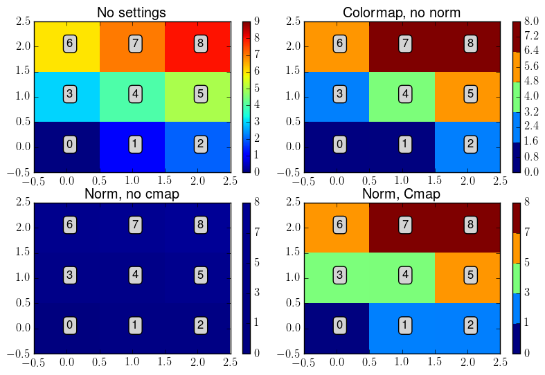
Example
- In the following code, we compare the representation of the example array when:
No changes in norm and cmap are applied (upper left)
No changes in norm are applied (upper right)
No changes in cmap are applied (lower left)
Changes in both norm and cmap are applied (lower right)
You will see that the only way to do it properly is to change both the norm and the cmap.
# Example for discrete color mapping

import numpy as np
import pylab as plt
import matplotlib._cm
import envtoolkit.colors

# function for adding text within the panels
def adding_text():
    """ Function for adding the text """
    for i in range(0, 3):
        for j in range(0, 3):
            plt.text(i, j, str(z[j, i]), bbox=bbox_props)

# Defining some plot parameters for the imshow function
plt.rcParams['image.cmap'] = 'jet'
plt.rcParams['image.interpolation'] = 'none'
plt.rcParams['image.origin'] = 'lower'

# defining the box settings for text display
bbox_props = dict(boxstyle="round,pad=0.3", fc="lightgray", ec="k", lw=1)

# creation of the data array
z = np.arange(0, 9)
z = np.reshape(z, (3,3))

# defining the number of colors and the boundaries
ncolors = 5
boundaries = np.array([0, 1, 3, 5, 7, 8])

# defining of a new jet colormap
cmap_jet_ncolors = envtoolkit.colors.subspan_default_cmap("jet", ncolors)

# defining the normalisation of the imshow function
norm = envtoolkit.colors.make_boundary_norm(ncolors, boundaries)

# Initialisation the figure
plt.figure()
plt.subplots_adjust(left=0.05, right=0.98, wspace=0.1, hspace=0.2)

# Drawing the data with no change in cmap and norm (UNCORRECT)
ax = plt.subplot(2, 2, 1)
cs = plt.imshow(z)
plt.title('No settings')
cs.set_clim(0, 9)
plt.colorbar(cs)
adding_text()

# Drawing the data with no change in norm (UNCORRECT)
ax = plt.subplot(2, 2, 2)
cs = plt.imshow(z, cmap=cmap_jet_ncolors)
plt.title('Colormap, no norm')
plt.colorbar(cs)
adding_text()

# Drawing the data with no change in cmap (UNCORRECT)
ax = plt.subplot(2, 2, 3)
cs = plt.imshow(z, norm=norm)
plt.title('Norm, no cmap')
plt.colorbar(cs)
adding_text()

# Drawing the data with changes in both cmap and norm (CORRECT)
ax = plt.subplot(2, 2, 3)
ax = plt.subplot(2, 2, 4)
cs = plt.imshow(z, cmap=cmap_jet_ncolors, norm=norm)
plt.title('Norm, Cmap')
plt.colorbar(cs)
adding_text()

plt.savefig("figure_col_norm.png", bbox_inches='tight')